Usability Study for the NYC Ferry App
Summary of Insights
More people are not using the ferry because the app UI and mapping functions are too complicated. Through user interviews and a usability test, users wanted the app to provide:
Route mapping
Ticket purchases
Departure times
However, 4 out of 5 users got frustrated with the map routing functions and said they would turn to other forms of transportation. The key factor was that without clear routing information, the users often struggled to know if the ferry was operating or would take them to their desired destination.
Thought Process:
This study began due to my own observation of the Ferry App. I was curious if the challenges I faced while using the app, which had pushed me to abandon using the ferry on a few occasions, were consistent frustrations for others. My hypothesis was: If these frustrations were consistent among participants, that would likely impact the ferry’s ability to attract new riders and might hinder current riders from using the ferry for new routes.
With this premise in mind, I sought to create a quick usability test to ask my participants what their goals were for the app, and understand why they might use the ferry while also testing the current usability features, and see how those features meet the needs of the participants’ stated goals. This was meant to be an exploratory/initial assessment, and due to my primary frustration with the app being usability-related, I thought this was a solid starting place. My intention would be to follow up this study with an A/B test of new design features (with both new users and current ferry riders), and perhaps user interviews for current ferry riders to insure the new app designs fulfill their needs.
For this initial assessment, I utilized a guerrilla sampling method, as my intended timeline for this study was two weeks and it was the quickest way I figured I could generate some initial insights. My goal for this project would be to validate the insights across a wider population in the future.
Set up:
Utilizing a guerrilla sampling, we interviewed 5 New Yorkers, ages 27-32 years old, with varying ferry experience, and asked:
Why ride the ferry?
What functions do you want the ferry app to perform?
Complete three usability tasks within two attempts for each task (finding the route from Wall st to Red Hook, ticket purchase, and ID departure times from Midtown West and 39th Street)
Overall Impressions of the app after the test?
User Persona:
From the participants’ responses, I formed a unified user persona.
Rachel:
Rachel is a Manhattan-based social copywriter with a desire to explore the city. She needs to quickly find her route to certain ferry stops and their proximity to her destination in order to better experience the city views and better understand the ferry network.
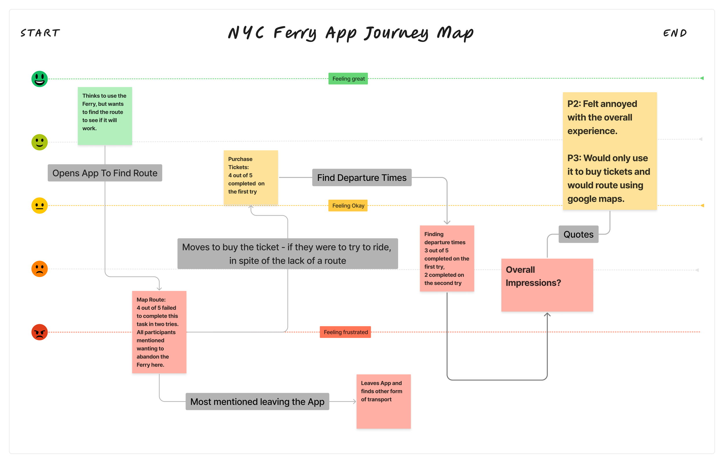
Journey Map:
With uniformity among the participants, I wanted to chart the general experience of the participants through a journey map.
No major emotional differences existed between users throughout the usability test assignments.
Participant Quotes:
“At this point, I think I would give up and then find the answers on Google because I am feeling upset and defeated,” and “The app is making me do a lot of work in order to get a route.” Two participants noted after trying to find a route.
“I wish there was an easy routing option that moved into a ticket purchase option.” One participant indicated they felt the steps could flow more effectively, from routing straight to ticketing.
“It took me a good number of clicks to find these times. I think the homepage is just so cluttered by the map. And that map is not very clear.” One participant noted after being prompted to find the arrival and departure times.
My Thoughts:
These findings were ultimately performed in this scrappy sampling method, and while the findings were uniform and consistent, I would want to target current users of the ferry app, as well as people who live near the ferry but maybe do not use it. Through a user interview, I’d be curious if they articulate similar difficulties within the app, or if the pain points they face are completely different.
Regardless of the sampling method, I do feel this initial study shows new users and non-frequent riders seem to really struggle to understand the app and how to get the information they are looking for within the system. My suspicion is that this would have an impact on how easily the ferry is able to attract new riders.
Insights and Opportunities:
1. Map routing is clunky and frustrating
Pain points:
A route is not shown if the user is too far from a ferry stop
Only the walking route to the stop is shown
No instructions to users when redirected to Apple Maps
3. Redirected to maps, but no ferry route in the maps, in spite of one being available.
2. Long walking routes
1: Difficulty routing
2. Frustration with the UI overall
Pain points:
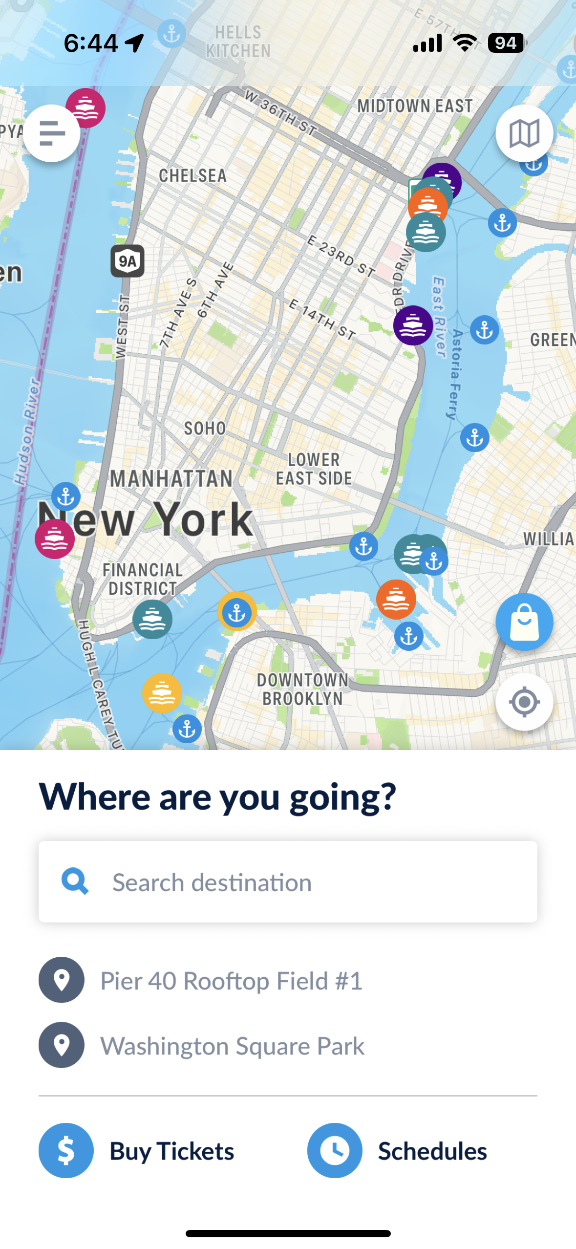
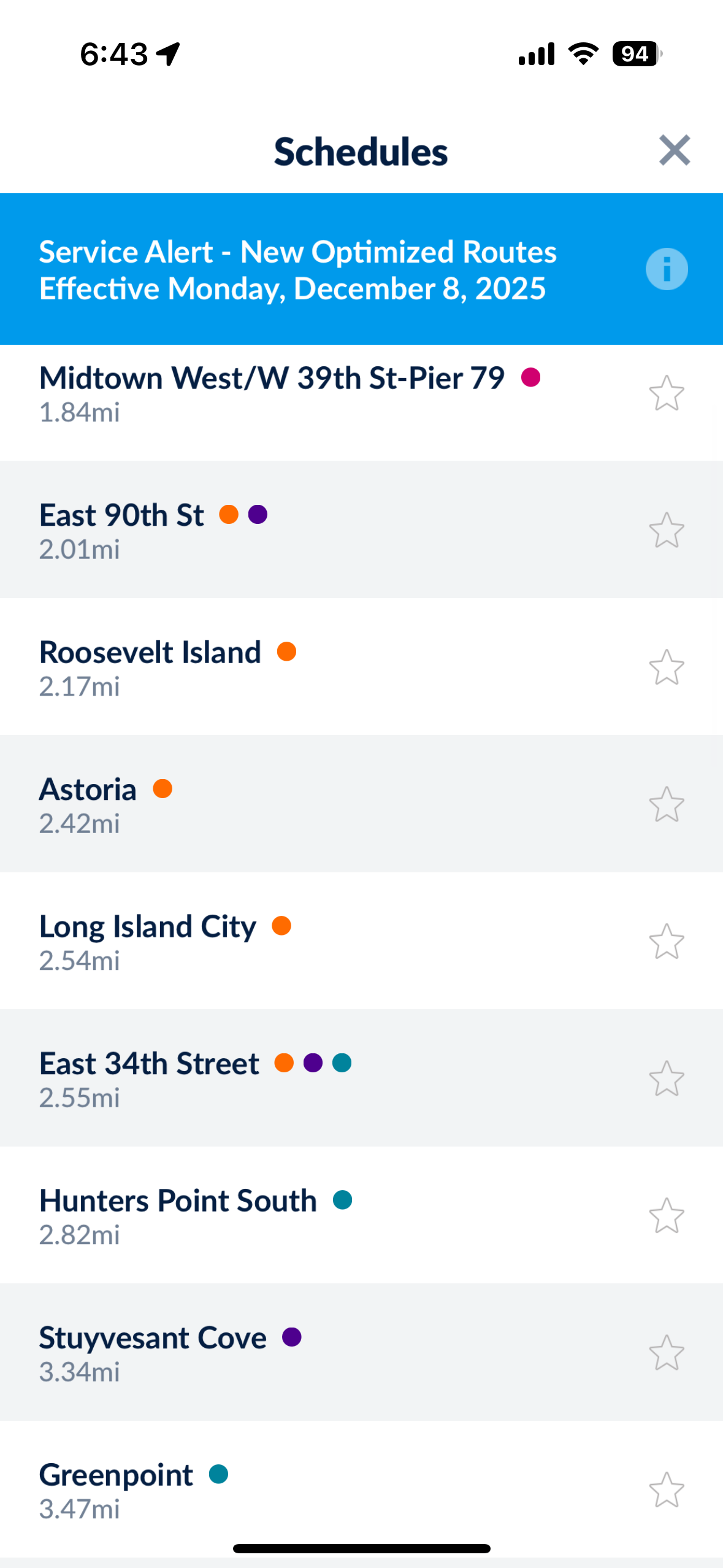
Users were overwhelmed by long lists within the app
A cluttered homepage and poor signifiers led to user confusion
Users struggled to understand labels across the app
1: Long list of stops on the “schedules” button
3: Users struggled with Labels like “St. George” and “Stuyvesant Cove”
2: Users expressed not knowing where to start.
Redesign:
One potential redesign is to remove the live mapping feature from the app, as a few users hinted they preferred to utilize the routes map (tucked away in the top right corner), rather than the live map on the home screen.
Implementing better signifiers across the app to indicate where the users can click and better affordances to help the user predict what they are clicking would improve the experience.
Prototype:
One big disconnect was the app’s functionality versus the user’s desire, which I think can be summarized best in jobs to be done language, which is:
People use the ferry to get to destinations near the ferry stops, not to get to ferry stops.
The app, though, struggles to direct users past the stop to their destination, often leaving users with confusing directions.
With these ideas, here is a general prototype I created in Figma to illustrate how the route map on the homepage might work. Clicking on “Sunset Park” highlights routes that get you to this stop, as well as any major connection points to other ferries. This guides users on where they can go to connect, rather than having them fumble with a difficult to use feature.
This prototype also attempts to demonstrate other solutions to how ferry stops are organized, and how they might be displayed clustered together as routes.
Taking some inspiration from the “Subway Now” app that provides real-time subway information across a simple map of the subway network, having a similar view of the boats making their way along their outlined routes might also solve the visual confusion of the “schedules” button.
Overall, I feel the app should focus more on seamless integration with other maps apps, rather than trying to do it all. Clarity to the users on what features the app can deliver on, would greatly improve the functionality of the system because users might better understand where this apps functionality ends and other map apps functions begin.
My Final Thoughts/Learnings:
While I thought this study fulfilled its purpose, with similar takeaways for all the participants, I do wish I had implemented an SUS or similar assessment to better quantify the results. In the future, I’d have included more participants, perhaps targeting both people who have not ridden the ferry and frequent users, to find out if differences exist between the groups. Many of these choices were due to the time and budget constraints.
With more time and a bigger budget, I would have loved to implement an unmoderated interview for the usability portion, then partner that study with user interviews to get more in depth insights, but considering the constraints, I was happy with the insights generated.
To follow up this study, I would consider either an A/B test to try out some of the discussed features of this study targeting both new users and current users. Another follow up study would be to utilize user interviews of current users of the ferry to better understand how they use the app and explore features they might like to see implemented.