Usability Study for the NYC Ferry App
More people are not using the ferry because the app UI and mapping functions are too complicated. Through user interviews and a usability test, users wanted the app to provide:
Route mapping
Ticket purchases
Departure times
However, 4 out of 5 users got frustrated with the map routing functions and said they would turn to other forms of transportation. The key factor was that without clear routing information, the users often struggled to know if the ferry was running, or if the ferry would take them to their desired destination.
Set up:
We interviewed 5 New Yorkers, ages 27-32 years old, with varying ferry experience and asked:
Why ride the ferry?
What functions do you want the ferry app to perform?
Complete three usability tasks (finding a route, ticket purchase, and departure times)
Overall Impressions of the app after the test?
User Personas:
From the participants responses we formed two user personas, one who lives in Brooklyn and wants to optimize Brooklyn based commutes, and the other from Manhattan who uses the ferry for leisure.
Tyler:
Tyler is a Brooklyn based, partnerships manager for an athletic
brand, who needs to quickly understand the ferry schedules in order to utilize the ferry to get to hard-to-reach Brooklyn neighborhoods.
Rachel:
Rachel is a Manhattan based social copywriter with a desire to explore the city, and needs to quickly find her route to certain ferry stops in order to better experience the city views and better understand the ferry route network.
Journey Map:
No major emotional differences existed between users throughout the usability test assignments. Here are color coded notes with quotes from the two personas relevant to each task.
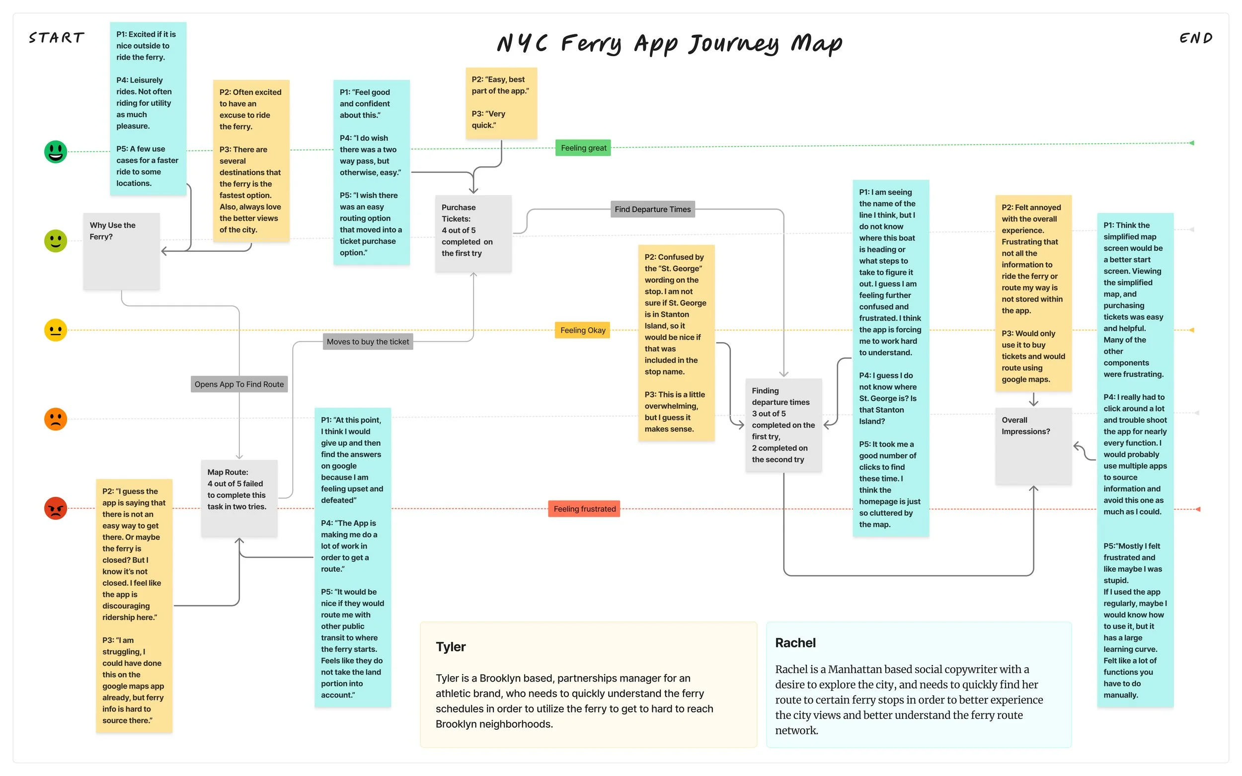
Insights and Opportunities:
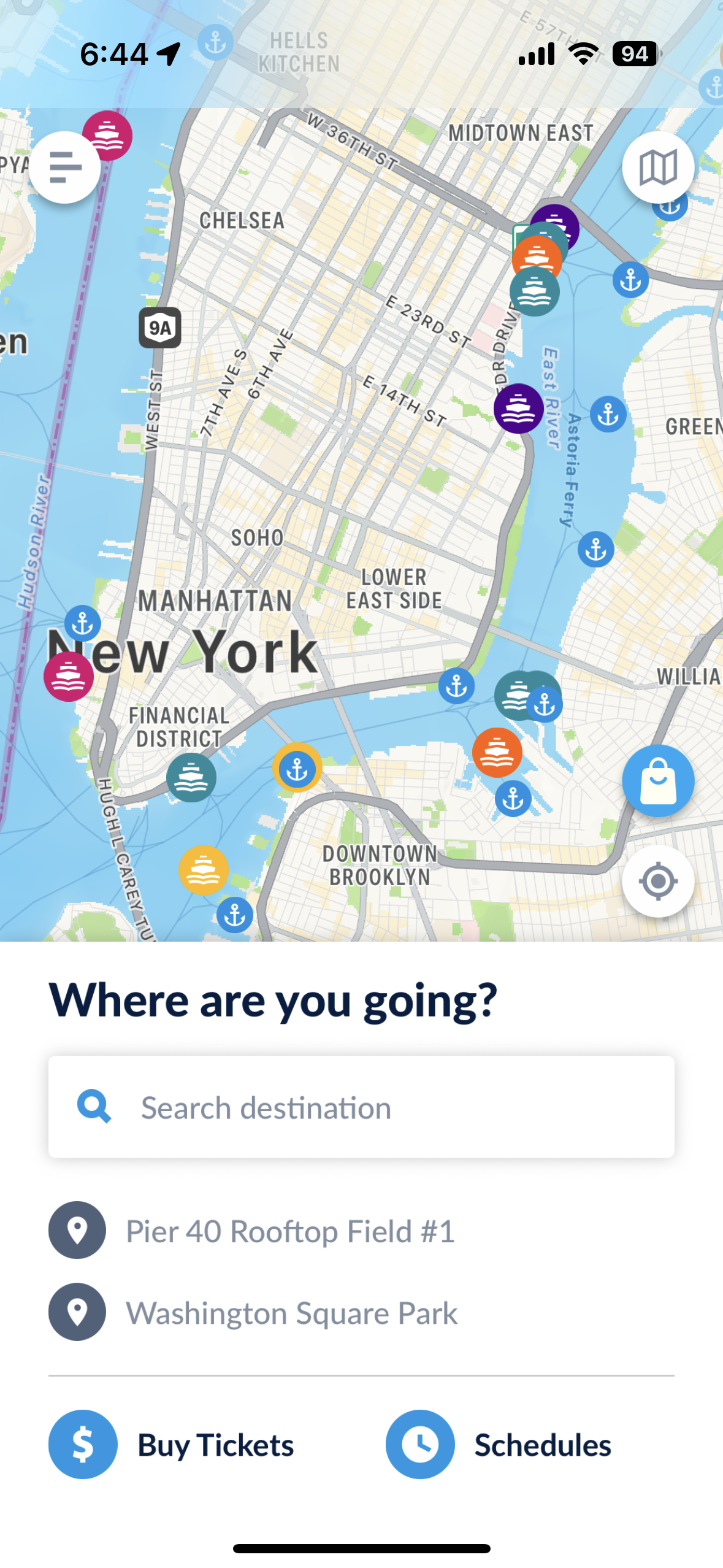
1. Map routing is clunky and frustrating
Pain points:
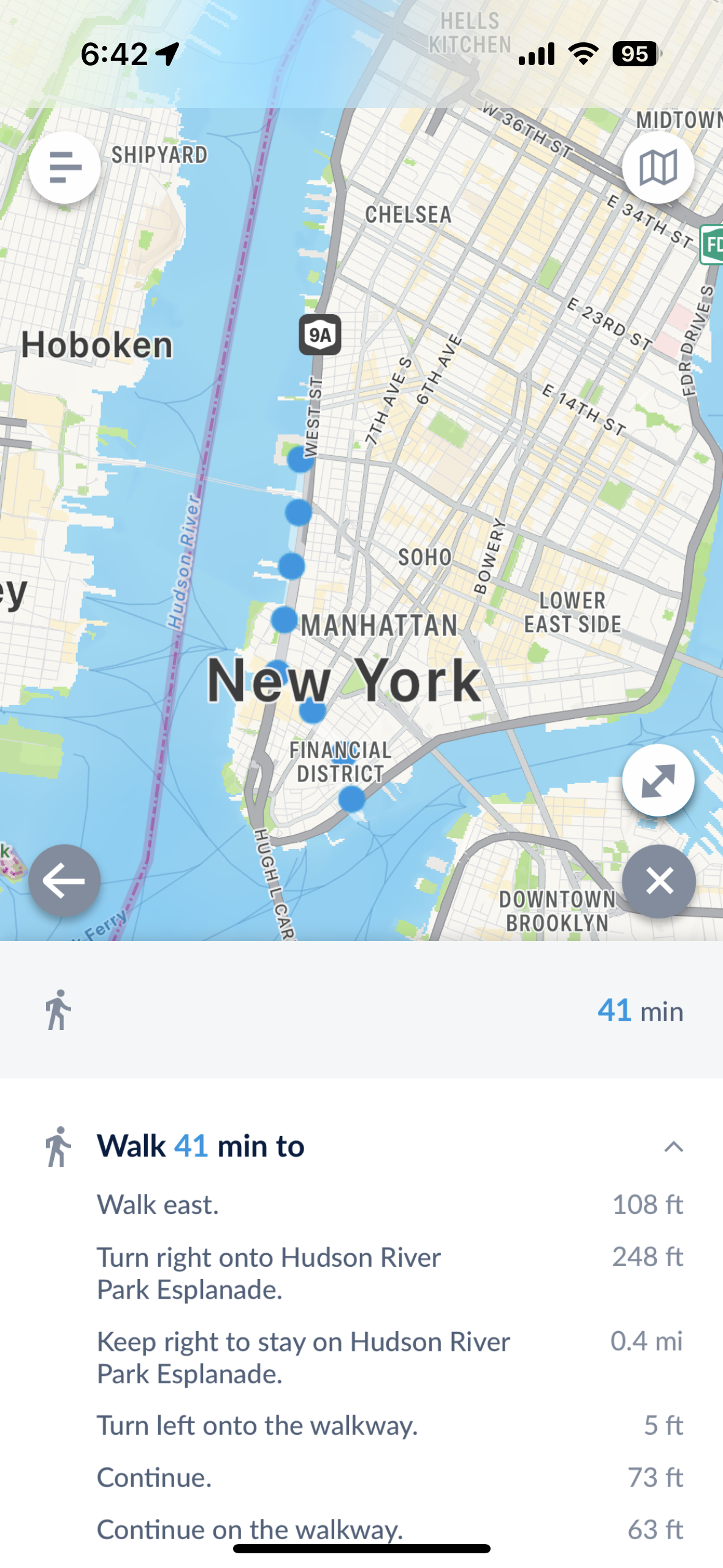
A route is not shown if the user is too far from a ferry stop
Only the walking route to the stop is shown
No instructions to users when redirected to Apple Maps
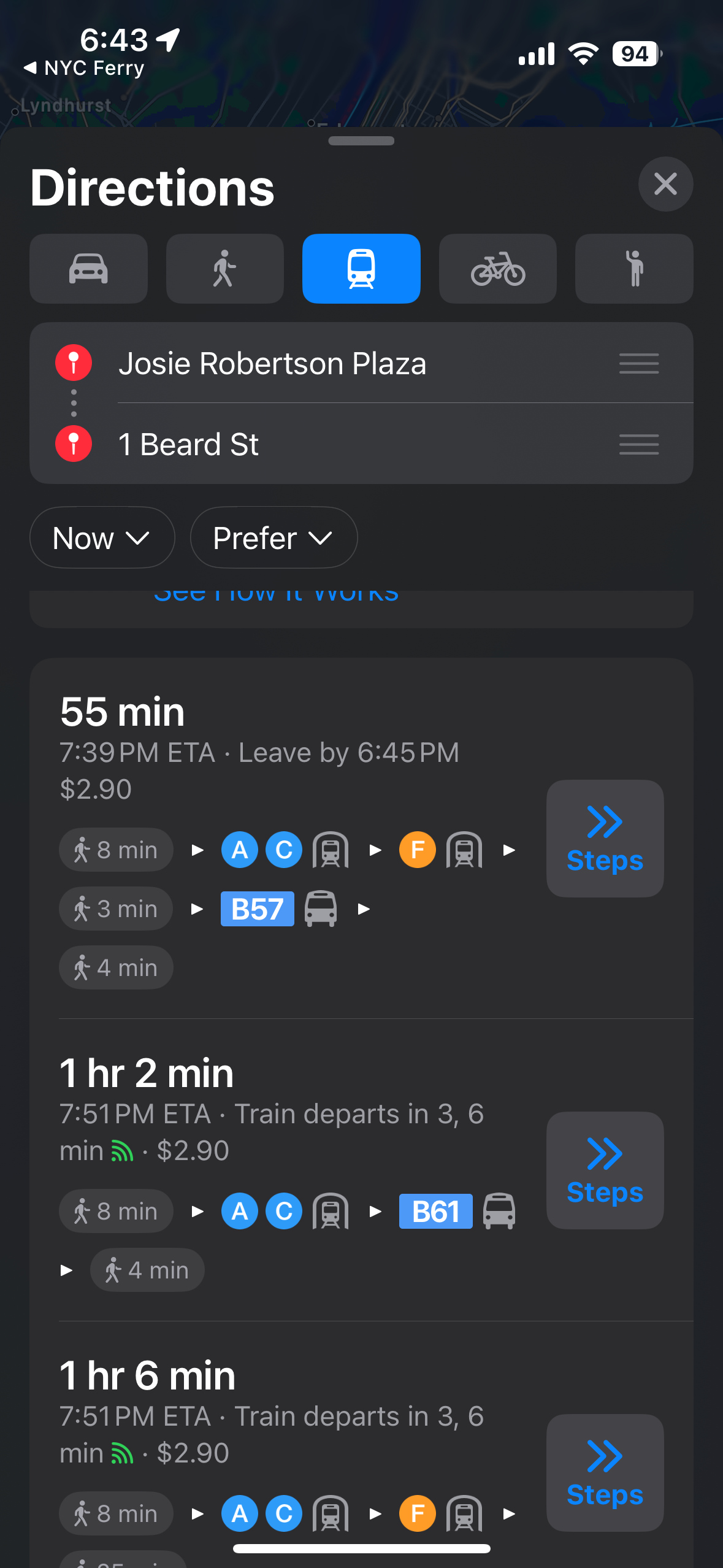
3. Redirected to maps but no ferry route in the maps, in spite of one being available.
2. Long walking routes
1: Difficulty routing
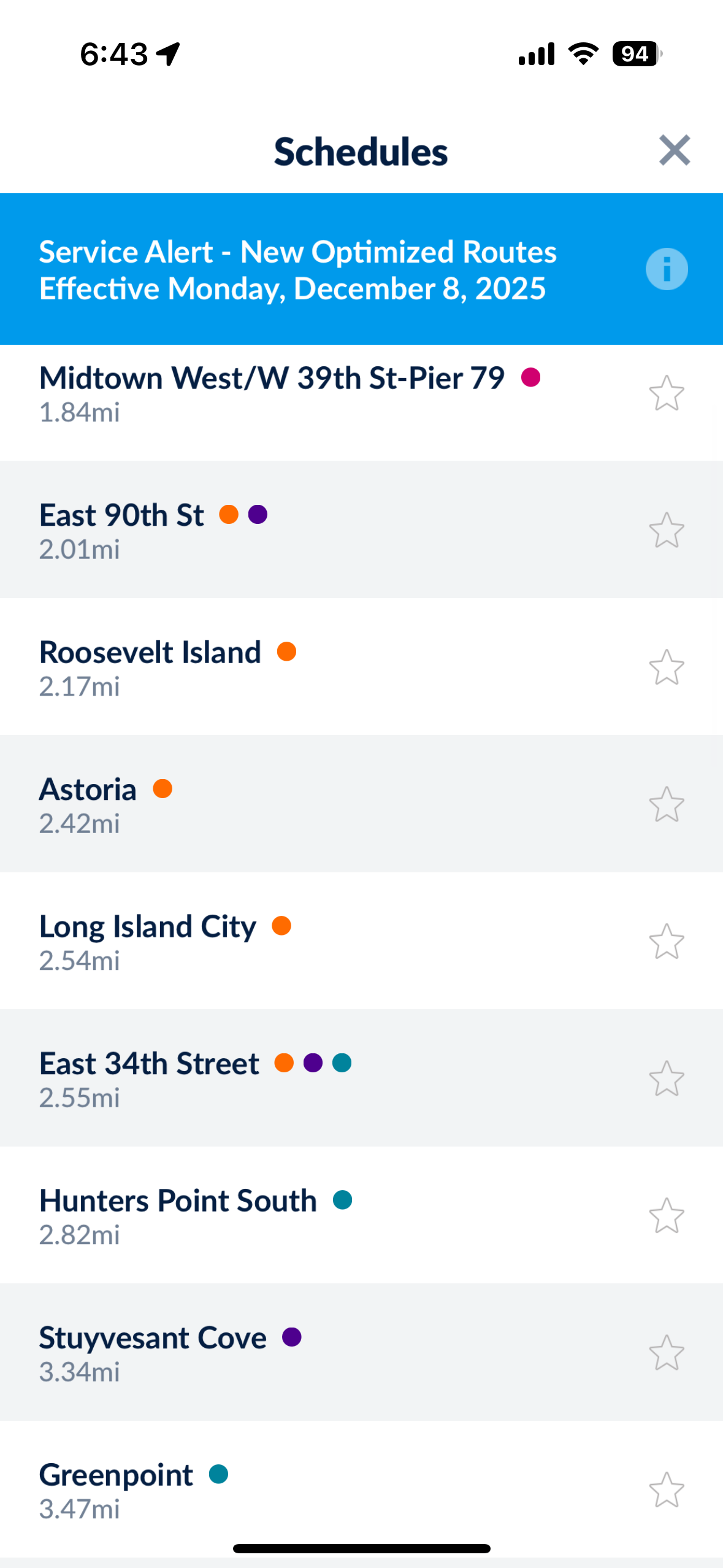
2. Frustration with the UI overall
Pain points:
Users were overwhelmed by long lists within the app
Cluttered homepage led to user confusion
Users struggled to understand labels across the app
1: Long list of stops on the “schedules” button
3: Users struggled with Labels like “St. George” and “Stuyvesant Cove”
2: Users expressed not knowing where to start.
Redesign:
One potential redesign is to remove the live mapping feature from the app, as a few users claimed they preferred to utilize the routes map (tucked away in the top right corner), rather than the live map on the home screen. One user even explicitly expressed this idea.
Prototype:
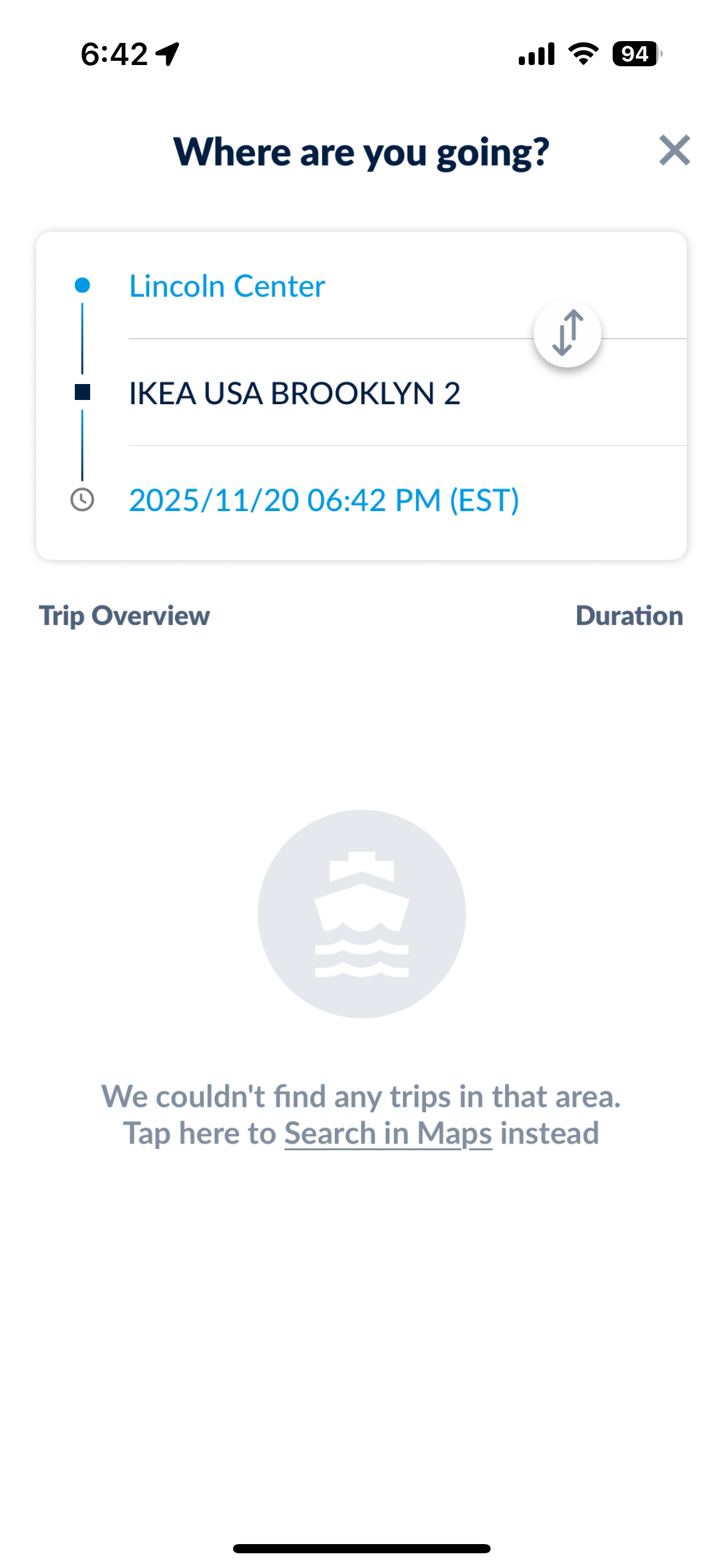
With that idea, here is a general prototype I created in Figma to illustrate how the route map on the homepage might work. Clicking on “Sunset Park” highlights routes that get you to this stop, as well as any major connection points to other ferries. This guides users on where they can go to connect, rather than having them fumble with a difficult to use feature.
This prototype also attempts to demonstrate other solutions to how ferry stops are organized, and how they might be displayed clustered together as routes.
Taking some inspiration from the “Subway Now” app that provides real-time subway information across a simple map of the subway network, having a similar view of the boats making their way along their outlined routes might also solve the visual confusion of the “schedules” button.