Behavioral Health UX,
an Information Architecture
and Intake Funnel Redesign
The organization is a group practice located in NYC, offering affordable counseling care on a sliding scale. Due to a poor conversion rate and missing their target sessions per month, the leadership team and operations team brought me on as an advisor and consultant to do user research and propose a redesign of the website landing page. A customer journey map, competitive analysis, and heuristic evaluation led to a wireframe sketch and prototype which clarified the path forward for stakeholders. A website redesign and user research will happen simultaneously during and after implementation to improve future iterations of the site.
Role
Timeline
Methods
Deliverables
01 · Background
A non-profit, group-practice in Manhattan offering
faith-integrated, affordable counseling care
The organization is a non-profit group counseling practice located in Midtown Manhattan, with 48 counselors on staff. Its goal is to offer affordable counseling care to New York residents and provide mental health training to behavioral health professionals, community leaders, and non-profits.
I had worked as a Mental Health Counselor with the practice for six years, so I was familiar with their business model, their offerings and referrals, and their EHR system integration. They operate with a pay it forward, sliding scale model where the revenue from those who pay higher counseling session rates and donations both help subsidize lower session fees for those who are in need.
02 · The Problem
The problem: 79 session gap
and poor website conversion
The practice expressed their website received ~4,000 visitors per month, with 300 to 400 visitors clicking “submit intake” which leads them to an external EHR intake form; however, only 50 new sessions per month result from those clicks (~1% conversion rate). The company had an objective to make up a 79-session monthly gap between their target sessions and their actual sessions served per month.
They wanted to bring me on to see what I could assess and diagnose regarding their website health and if a redesign would have any impact on their total session count.
Visitors
4,000
Unique, per month
Submit intake
300–400
~9% of visitors
New sessions
~50
~14% of those clicks
Conversion
1.25%
Visitor to session
03 · Scope & Constraints
Scoping the work
against a one-week clock
My Role
So I was brought on as a Research Consultant and UX Strategist. I scoped the project and the research, setting the research roadmap and designed prototypes in response to the research content, as well as forming any follow-up steps for future research on both the UX design of the website and on the business strategy and service offerings and their viability given the competitive landscape of counseling in NYC.
Constraints
Several constraints were a tight budget, quick turnaround time of one week, and a desire to stick with Squarespace in order to preserve the staff’s ability to edit the site in the future.
Optimal Research Roadmap
With more time and budget the research roadmap would have been:
- 01
Five to eight user interviews — qualitative data on what people want from counseling websites.
- 02
Competitive analysis — the interview themes, set against the competitors’ sites.
- 03
Sketches, then an unmoderated A/B test — on UserTesting or Dscout — how early sketches perform, and direction for iteration.
- 04
Prototype, journey map, reorganized IA — built on the competition’s structure, to meet the mental models users already have.
- 05
Deploy, then web analytics — monitor the conversion rate against the redesign.
- 06
A tree test in the background — chart user paths, and catch what structure or copy still confuses.
04 · Audience Segments
Three loosely defined population segments
from my experience on staff
Based on what I understood of the client base at the practice, I segmented the population into three main groups. This segmentation process was a shorthand method based solely on my experience working with clients at the practice for six years given the time constraints of the study.
The three segments were:
People who wanted to get counseling from this practice specifically
People who wanted faith-integrated therapy but were open to all faith-integrated therapy practices
People who were looking for therapy and were open to faith-integration, but not specifically looking for it
05 · Audit & Prototype
Working through the site
through the eyes of a new user
A first pass as a new user
With this vague direction and a tight timeline, I started to brainstorm and plot a roadmap. It had been a while since I last visited the site and with conversion being the primary concern — I started working through the website as if I were a new user. Right away I could tell the micro copy, signifiers and affordances, and the happy path were all a bit complicated or non-existent. I also recognized much of the information I would want when comparing and considering a counseling service was difficult to find or too vague on the practice’s site.
Narrowing the scope to fit the brief
With budgetary constraints and the time constraints, I had to reflect on what the goals were in light of my first impression and how could I operate more cleanly within the confines of the brief. I came to this: we need to create a clear conversion path for people as well as organize the information on the website according to frameworks we know work. Rather than research and design from a bad starting place, I felt the best practice would be to iterate a design from industry principles and then research from there.
Ultimately, with a non-profit operating with a tight budget, every month this design does not move forward, they lose a lot of potential clients. So a redesign that uses tried and true UX and marketing principles is bound to convert better than the current site, with the improved conversion, we can then iterate from a more principled design framework rather than try to perfect a design we know is foundationally broken.
Site mapping and competitive analysis
My site mapping took place within Claude Cowork, uploading a video pass of the site and having Claude take screenshots and then stitch them together into full page renders while also charting the information architecture. At the same time, I used Claude Code to generate Storm reports regarding the practice and their service offerings, pricing structure and website in comparison with NYC competition, to more directly assess where the organization stacks up among counseling practices in the city.
The three points of comparison
As this was taking place, I began to think about my own counseling experiences and experiences with clients as a counselor, to remember what I considered when looking for a counselor and what clients often told me about looking and comparing counselors in NYC. I came up with three main points of comparison:
- 01
Price — I heard this the most from clients at the practice and one of my main considerations as well.
- 02
Schedule — this was one of the biggest ones I heard as well, if price was not a factor, scheduling definitely was, and often both mattered to people.
- 03
Counselor understanding — this was a bit loose, but the ability for people to feel like the counselor would be able to help them and understand them and someone they could share with.
Personally, I have seen many people who have made both 1. and 2. work for them because 3. was so important.
After Cowork finished the full site mapping, I collaborated with Claude regarding the most likely path customers would take and diagnose the main weakness of that path against these three points of comparison.
Something I realized as I was collaborating was that two important design points also needed to be answered for good conversion, and that was “what happens next once I’ve decided that the schedule, the price, and the counselor works for me.” I realized that the design needed to not only answer the initial comparison questions but also the process question, which is 1. what is the very next step (in this case: fill out the intake), and 2. how can I take that step?
Mapping the current journey
With this in mind I built the customer journey map for the website in its current form. This almost acted as a design brief, so that as I was prototyping I can map all of the design changes against the comparison points and customer questions that come up through the journey map.
Building the prototype
I then set out to build a prototype and utilized Claude Code in order to do this, building out quick CTAs, a clear design system and utilizing the Squarespace section by section design format to answer the user questions progressively. Something that came up in the design process was that I wasn’t actually sure if the order that I put the customer questions in are the order in which the customer wants those questions answered. Due to the time constraints I had to leave this question unanswered, however it does provide ample material for a follow-up study.
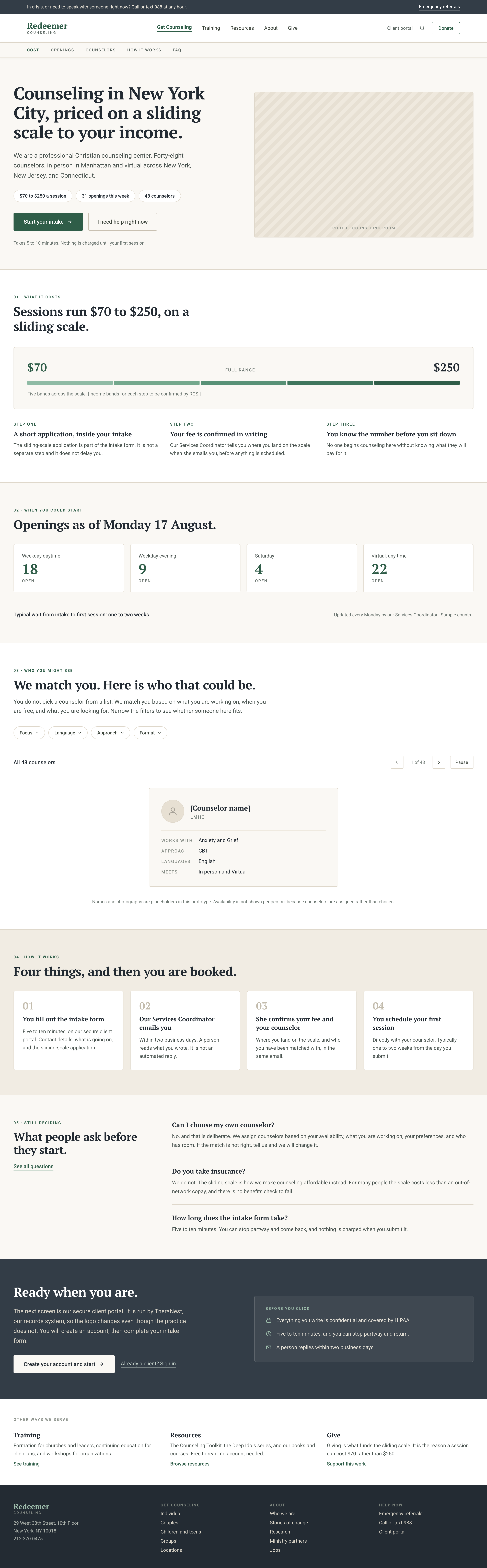
Prototype
The homepage prototype, read against the five questions
Charting the projected journey
Once the mock-up was complete, I was then able to chart the customer journey as I projected it against the new design. The new design was not flawless, and still left the customer with questions and comparison points they would have to consider against other counseling services, but I did feel like the design better answered the customer’s potential questions and put more information in an easy-to-read format at their disposal rather than burying it in confusing information architecture.
06 · Outcomes
Presented, agreed,
and handed to the builder
After the mock-ups had been designed, I presented a slide deck outlining my research to the operations director and an operational consultant assisting on the marketing campaigns. I structured the presentation by explaining why the research is relevant and clarifying the differences between my presentation and the previous presentation and report they received from another consultant. I then discussed the current website design, why it needed help, and how the new design prototype addresses the design concerns and would impact conversion.
They both ultimately left with a clear vision for how the website could be improved and some tactical steps that they can take to begin implementing the new design prototype.
Lessons
A couple main lessons that I took away from this engagement was: contextualized and specific method choices can often depend on the individuals designing the study and composing the design team. The stakeholders mentioned another designer and researcher had proposed a different research roadmap and design plan earlier in the year, but they had turned it down. They expressed my understanding of the business and my expertise in the subject matter made my proposal extremely relevant in a way that felt personalized to them. Reflecting on that more, my expertise and experience in the industry and knowledge of design principles gave me easy access to take initial steps with them.
I think in some ways though, this can be a double-edged sword, because so many assumptions can become so normal that surprises and innovation through user interaction can be squandered through the over-reliance on assumptions.
Furthermore though, my next lesson was that user research doesn’t always have to go first, it can be concurrent or even after initial designs. This could be the case especially when the interface wasn’t initially built on good UX principles and delaying intervention costs something. I’m still hopeful that surprises in the analytics and follow-up research might still be waiting for discovery and potentially unique or personalized design iteration might still be possible.
Next Case Study
Civic Tech · UX Research · 2025
Lost at the First Screen
Contact Information
Want to talk? Good news:there's no co-pay anymore.
thornton.coen@gmail.com