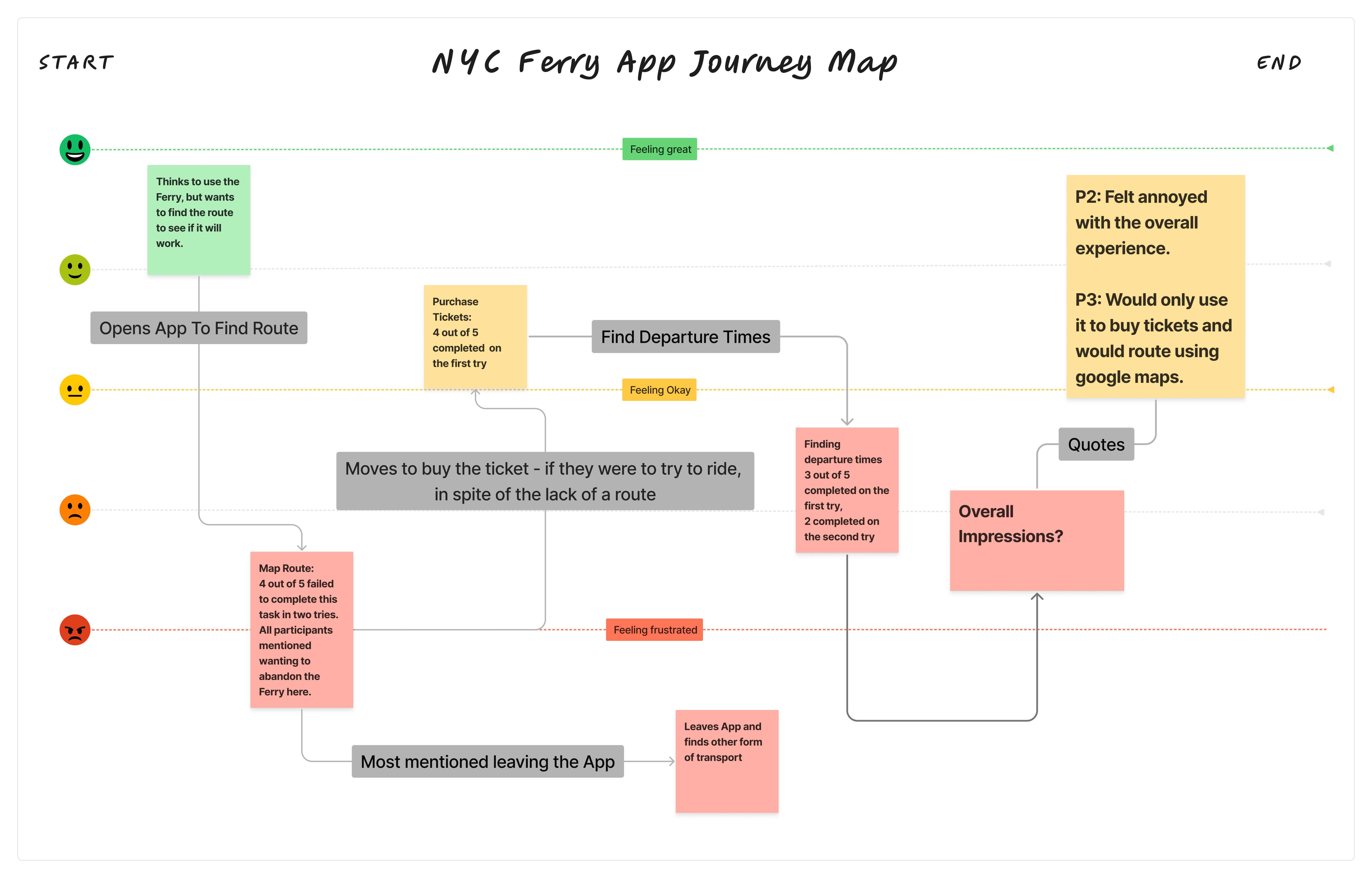
Session Evidence
Moments where the app lost participants
These screenshots were taken during live sessions. Each one marks a moment where a participant lost confidence — where the app's response pushed them toward giving up rather than forward. Hover each to see what it meant.
Hover to expand
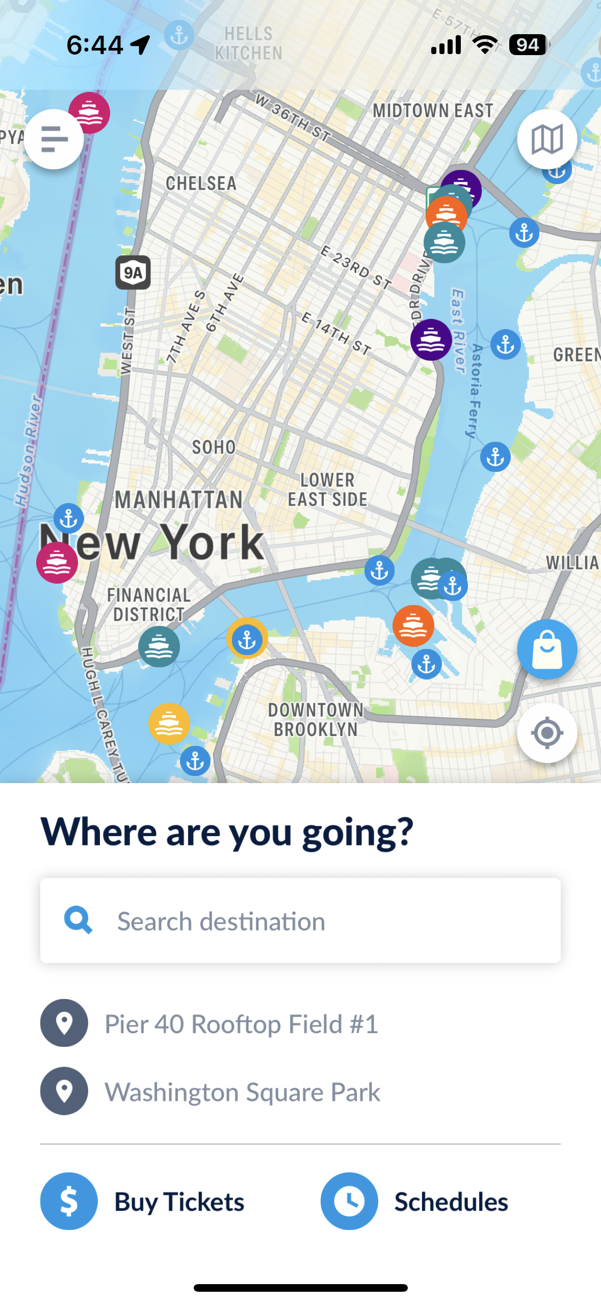
Cluttered homepage
Task 1 · Map a Route
What participants were trying to do
Find out whether the ferry could get them to a specific destination — IKEA in Red Hook. They needed a clear entry point to input a starting location and destination to confirm a route existed.
What they encountered
The home screen presented a live map, search bar, recent locations, and two action buttons simultaneously. All five participants described not knowing where to begin. Several attempted the search bar but were unclear whether it was for routing or ticket purchase.
Hover to expand
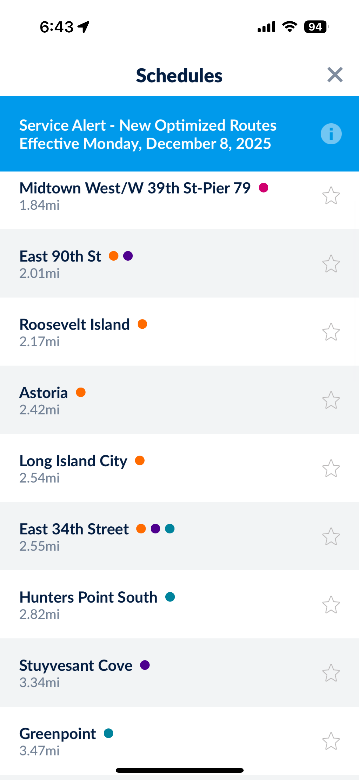
Schedules list
Task 3 · Find Departure Times
What participants were trying to do
Find when the next ferry departed from a specific pier. They expected to see a schedule organized by route or stop — something they could scan quickly to find their option.
What they encountered
Tapping "Schedules" produced an undifferentiated list of all 22 stops sorted by distance, with no routes, no filtering, and no indication of which stops were connected. Most participants scanned briefly and abandoned the screen within seconds.
Hover to expand
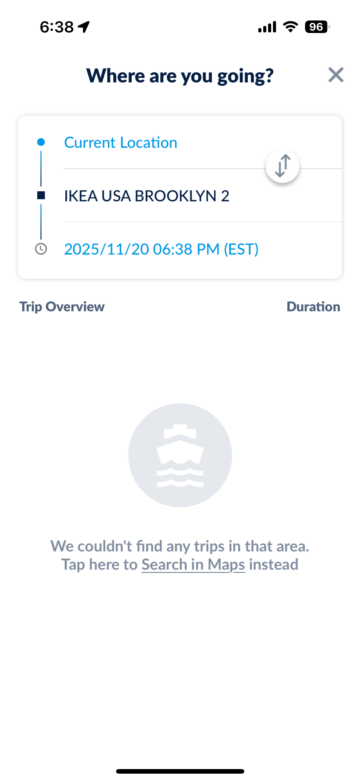
No trips found — attempt 1
Task 1 · Map a Route
What participants were trying to do
Confirm whether the ferry could get them from their current location to IKEA USA Brooklyn 2 — their actual intended destination, not a ferry terminal name.
What they encountered
The app returned "We couldn't find any trips in that area" — no explanation of why the search failed, no nearest alternative stop suggested, and no indication that a ferry route to that area actually existed. The only option offered was to leave the app entirely.
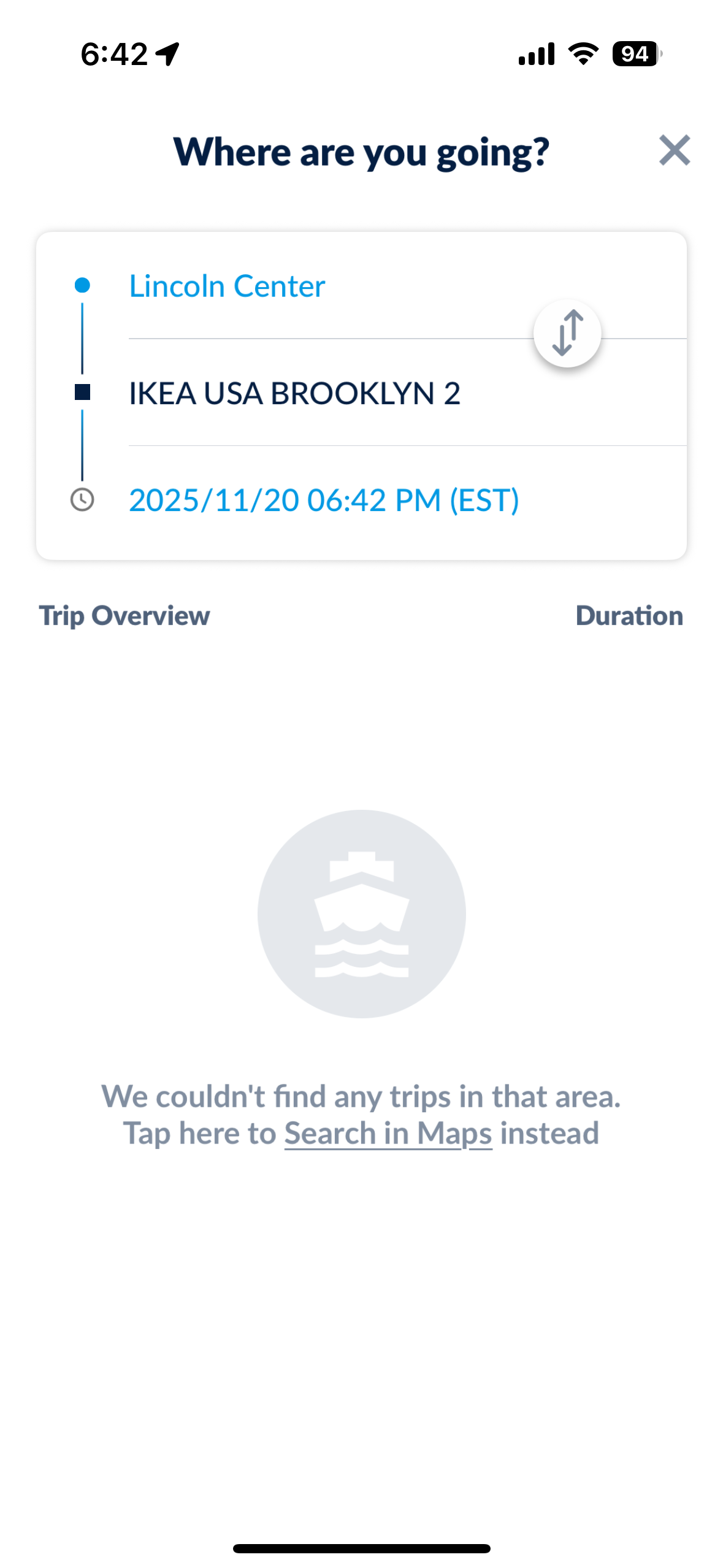
Hover to expand
No trips found — attempt 2
Task 1 · Map a Route
What participants were trying to do
Route from Lincoln Center to the same destination, testing a different starting point to see if the result would change.
What they encountered
The identical empty state. The app requires a ferry terminal as the destination — not a street address — but this constraint is never communicated. Both participants concluded the ferry did not serve their destination, when in fact it did.
Hover to expand
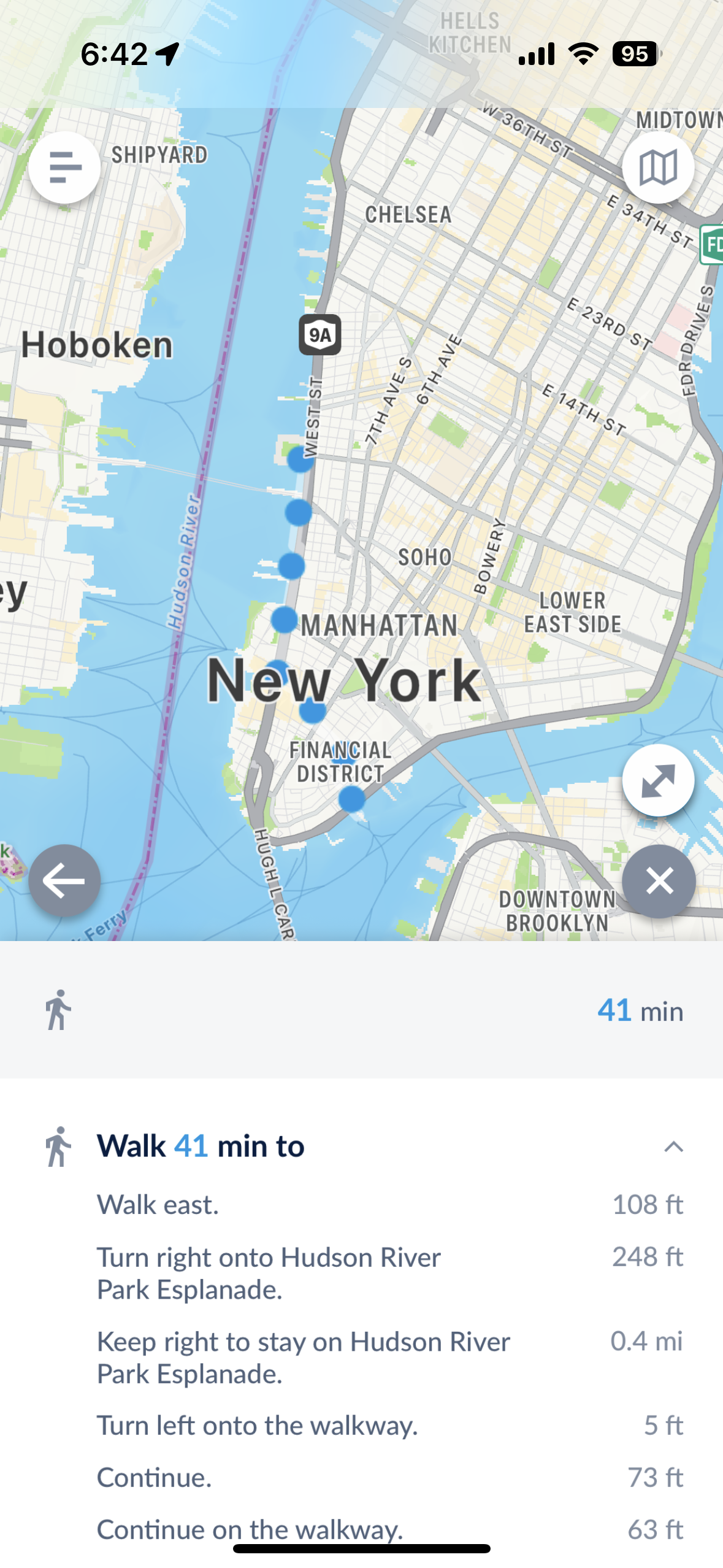
Ferry app walking directions
Task 1 · Map a Route
What participants were trying to do
Route to a ferry stop from their current location using the ferry app's built-in routing feature.
What they encountered
The ferry app's own routing returned only walking directions to the Ferry Stop, no bus or subway routing. This forced users to leave the app to find faster methods to get to ferry access.
Hover to expand
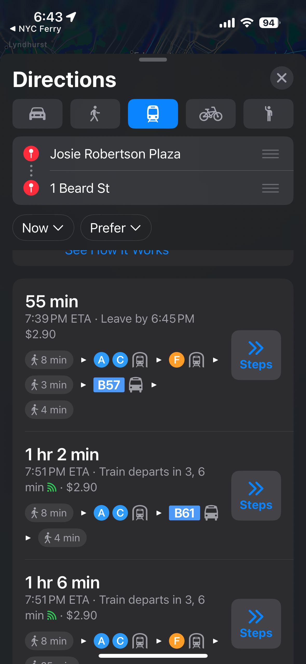
No ferry in Apple Maps
Task 1 · Map a Route — after leaving the ferry app
What participants were trying to do
After the ferry app returned a "No routes" result, participants followed the app's suggestion to open Apple Maps, switching to transit mode to find a public transit option.
What they encountered
Switching to Apple Maps transit from the ferry app's "No routes" page surfaced only subway options — despite a ferry route existing for this exact trip. Participants assumed the ferry was not running that day or simply didn't serve their destination.