Prototype
Five questions, asked in the
order they get asked
Before someone books a counseling session they want to know four things and then one more: what it costs, when they could start, who they would be seeing, and what the very next step is — then how to take it. The current Redeemer landing page answers none of them. It offers three gateway cards, a mission statement, a resources carousel and a newsletter signup.
The prototype answers all five, and it answers them in that order, because the section order was chosen by what disqualifies a visitor fastest. What follows is the ledger, question by question, then the full renders.
Questions
5Answered today
0Answered in the prototype
5The ledger
What the landing page
does and does not answer
What will this cost me?
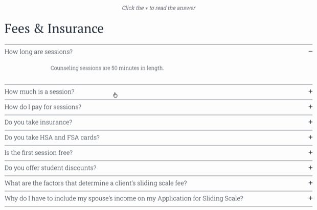
No figure appears on the landing page. Fees live on a separate page, each one collapsed behind a plus sign, and the scale is described rather than numbered.
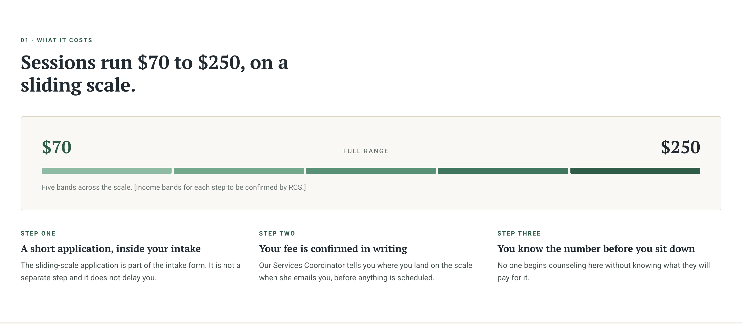
Sessions run $70 to $250 on a sliding scale. The floor comes first, a five-band range bar shows the spread, and three steps explain how the fee is set.
When could I start?
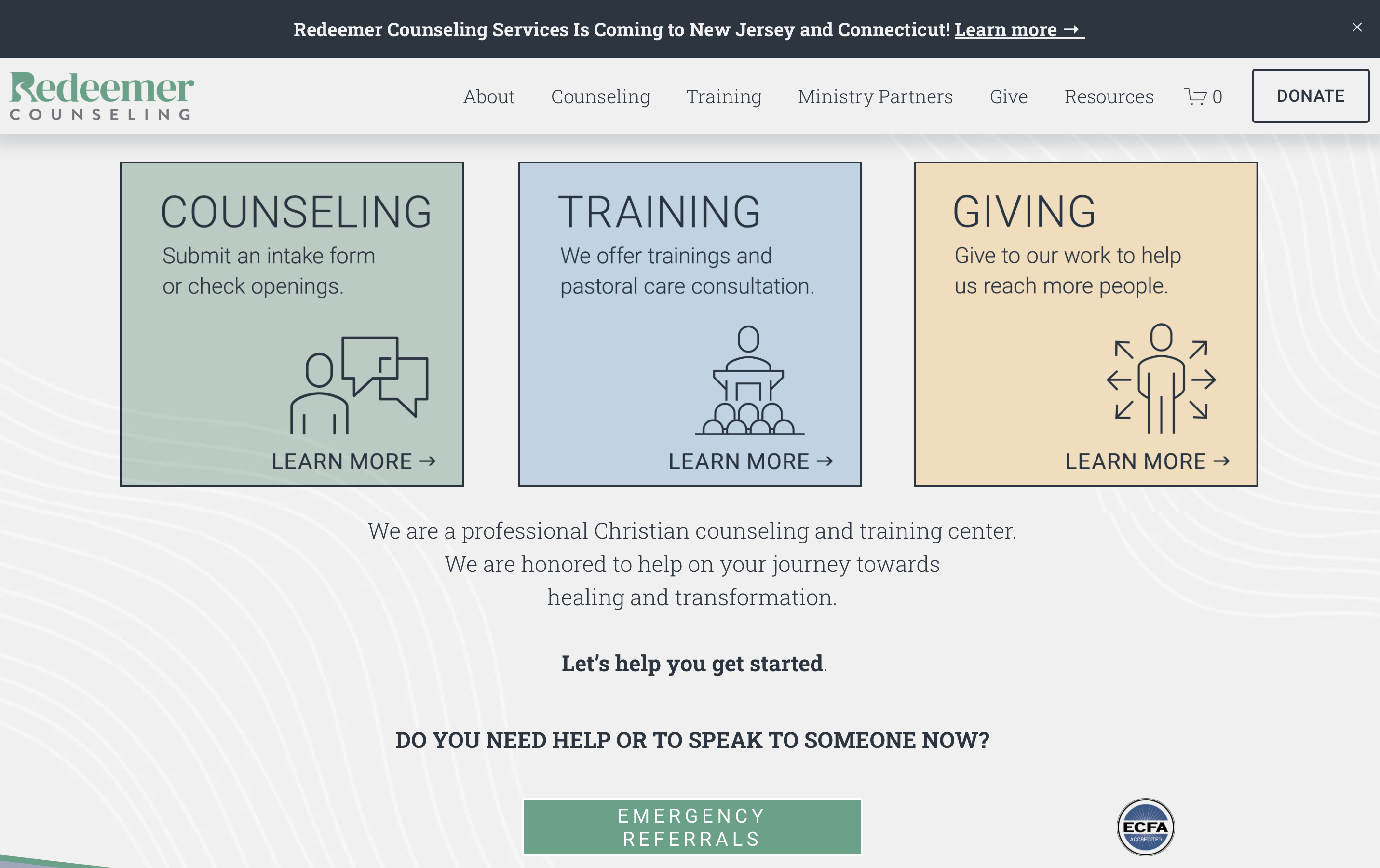
The only route to availability is four words of small text inside a gateway card — “or check openings” — and the page it leads to is a matrix, not a count.
Dated counts by slot type — weekday daytime, weekday evening, Saturday, virtual — with the typical wait from intake to first session stated underneath.
Who will I see?
Forty-eight counselor bios sit on another page with no filters. Nothing on the landing page indicates who works here or how a match is made.

Filters for focus, language, approach and format, over a rotating introduction. The copy says plainly that counselors are assigned rather than chosen, and why.
What is the very next step?
The page says “Let’s help you get started” and then stops. There is no sequence anywhere on it — no indication of what happens first, or how long any of it takes.
Four steps, each with its own duration, moved above the call to action instead of below it. A person reads the whole path before deciding to enter it.
How do I actually start?
Submit Intake opens a new tab on a different domain with no interstitial and no Redeemer branding. The visitor is asked to create an account by a system they have not been told about.
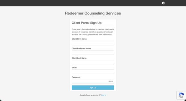
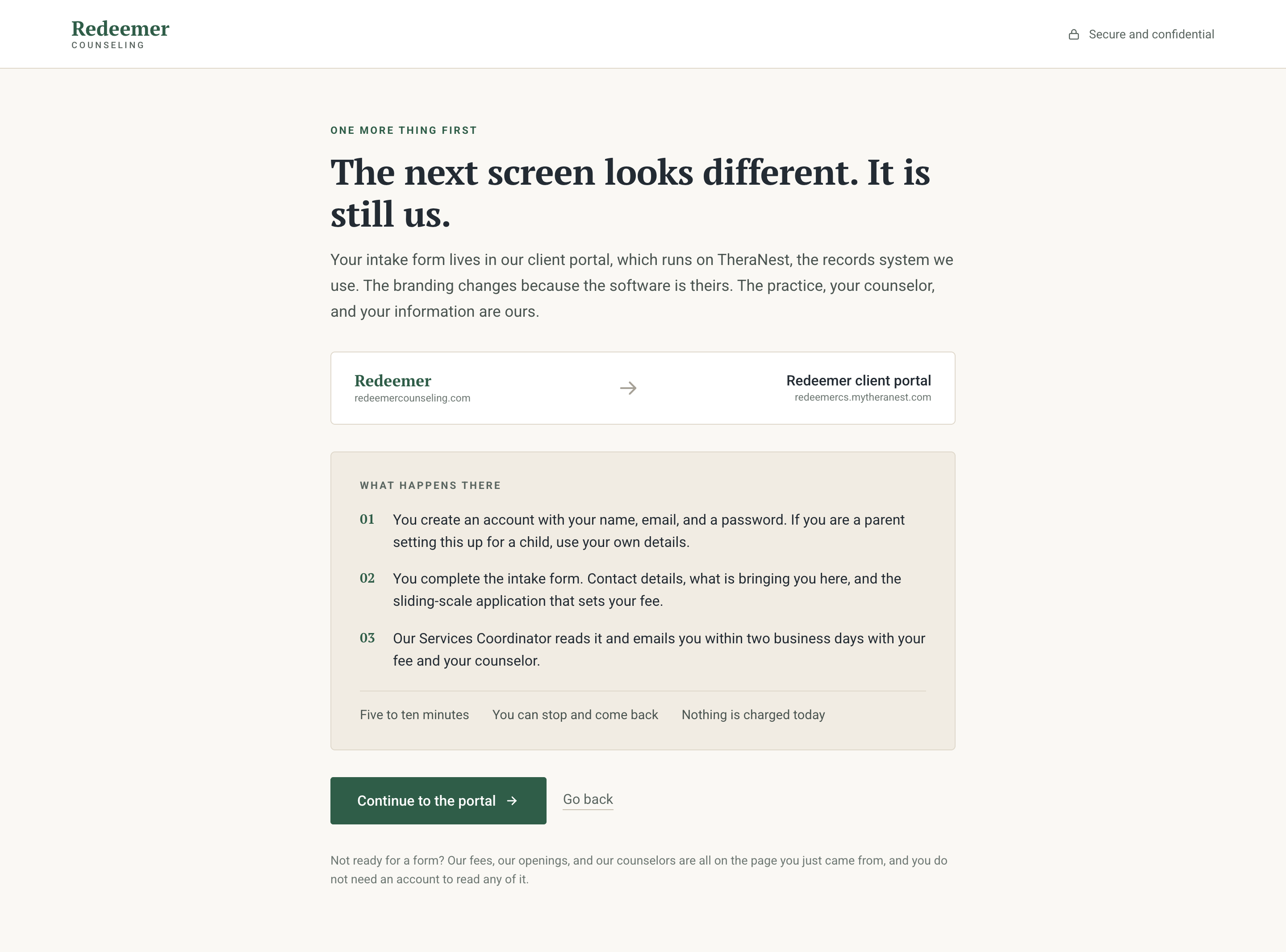
An interstitial names TheraNest before the click, not after it, and lists what happens in the portal. The next screen looks different, and the page says so first.
Full renders
The whole page,
both ways round
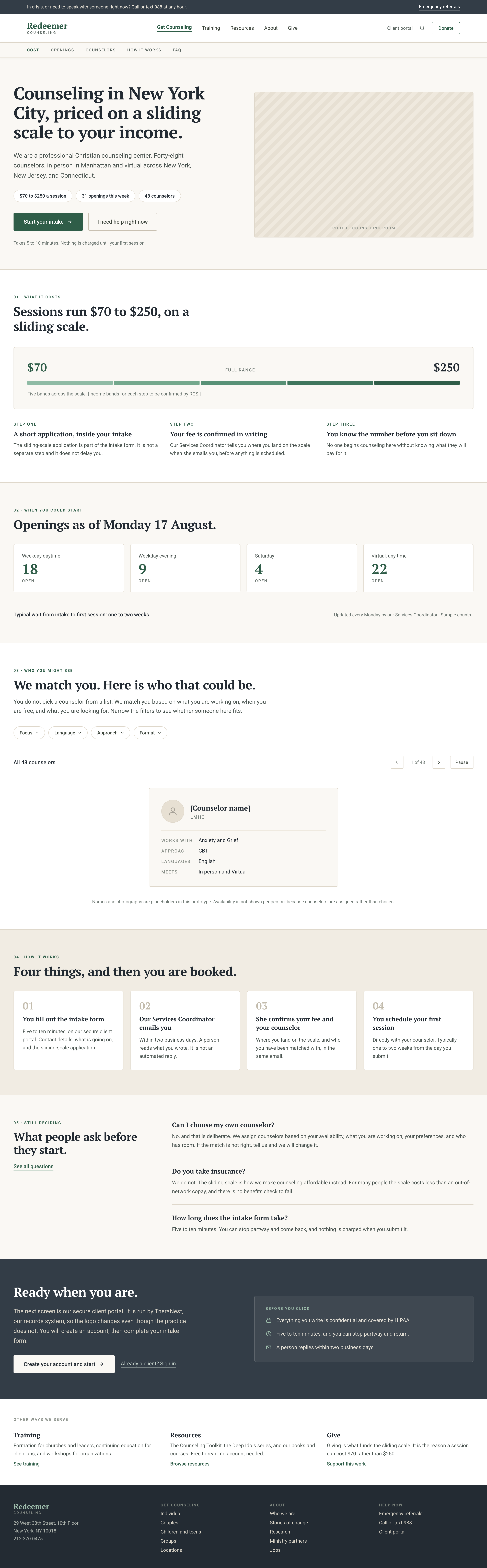
First I wireframed the new design, then designed this prototype for the presentation to stakeholders.
